Guerrilla, Cheeky, isn't it?
Project scope
Self-promotion guerrilla campaign at Agency at Night Rotterdam 2026. Guerrilla campaign, stickers, landing page, data entry tracking. Role as Creative Director and Designer.
Scenario
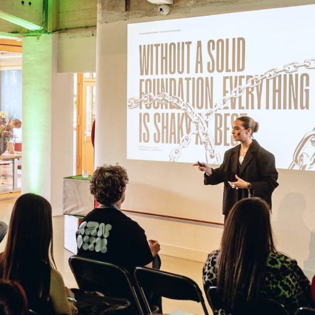
If there's one thing 13 years in this industry has taught me, it's that talent isn't rare - attention is. In the Netherlands, the math is brutal: a single design role in Amsterdam or Rotterdam can pull 300 applicants. 300 strong portfolios, 300 people who can do the job, 300 versions of the same ChatGPT cover letter promising the same passion, all competing for the same glance. Being good enough was never the hard part. Being seen and remembered is. Through the years, I learned to stop competing on quality and win on nerve instead: doing what no one else thought to or had the guts to dare. Every year, Agency at Night turns Rotterdam inside out: 47 agencies open their doors to 5,000 visitors moving studio to studio, across 200+ talks and workshops. The entire industry, one city, one night. In 2026, most people saw a night of talks and drinks. I saw an opportunity - and one that I had to take.
Inspiration
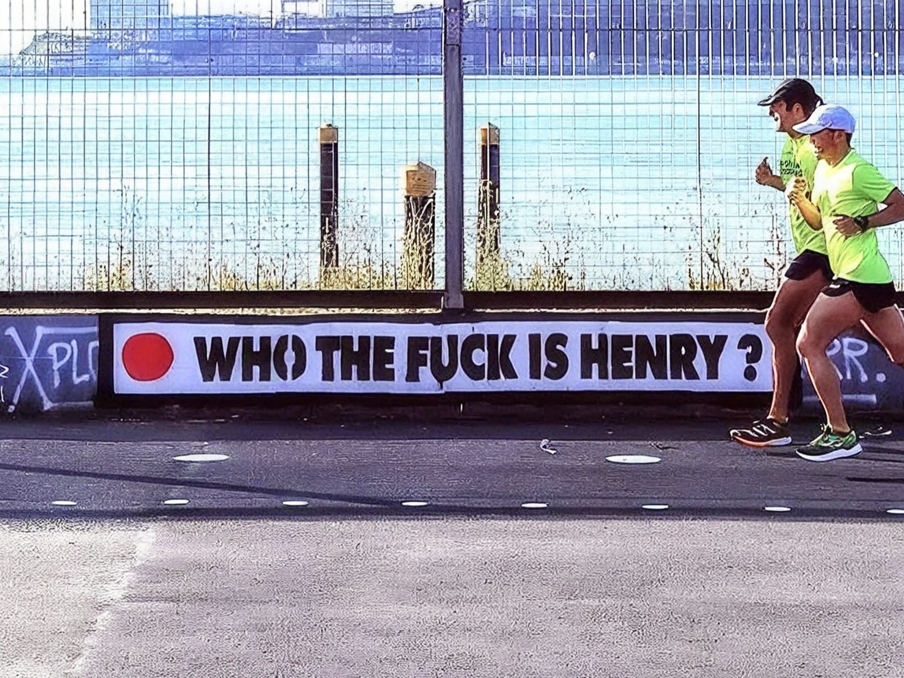
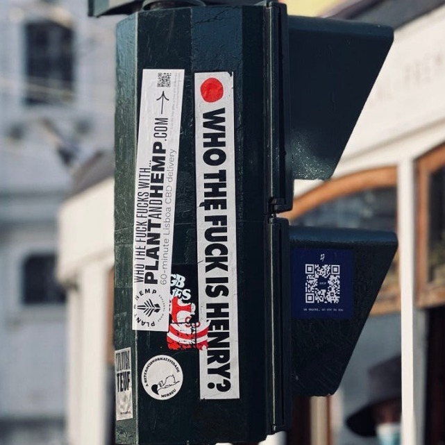
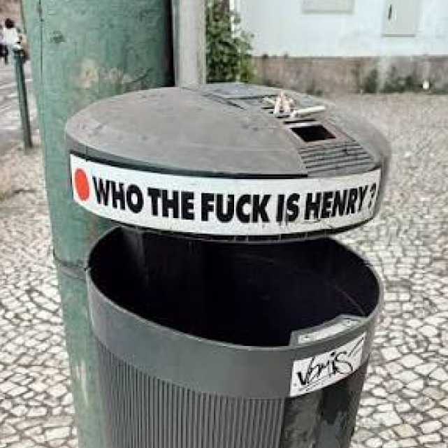
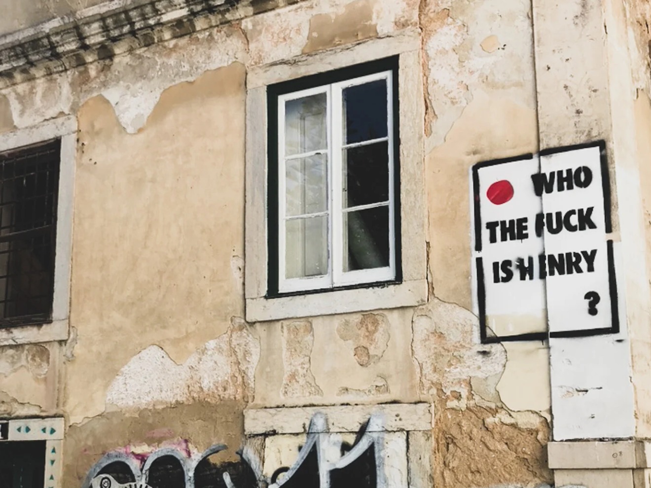
You don't get noticed in a room full of talent by being the loudest. You get noticed by being the cheekiest. My reference was Who the fuck is Henry? - a Portuguese guerrilla persona who was never that good in asking permission, and who no one in Lisbon has forgotten. For years, Henry covered the city with a single unanswered question, until it answered itself: everyone was asking it. That was the ambition. Not to introduce myself - to make people want to find out.
Approach
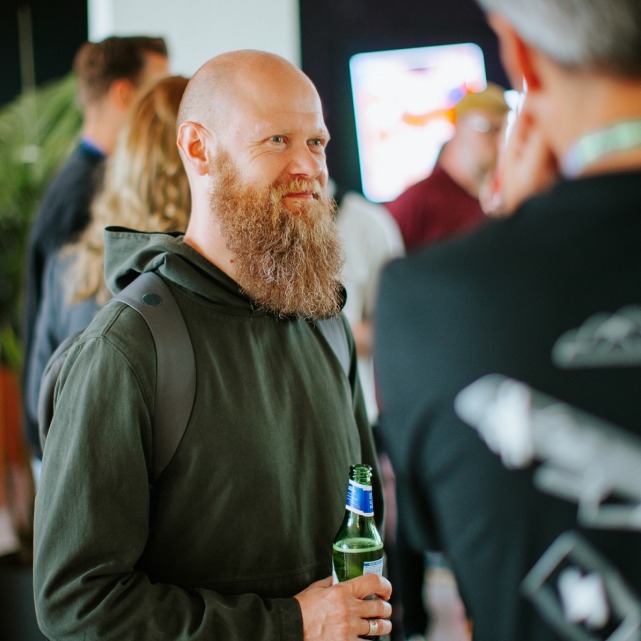
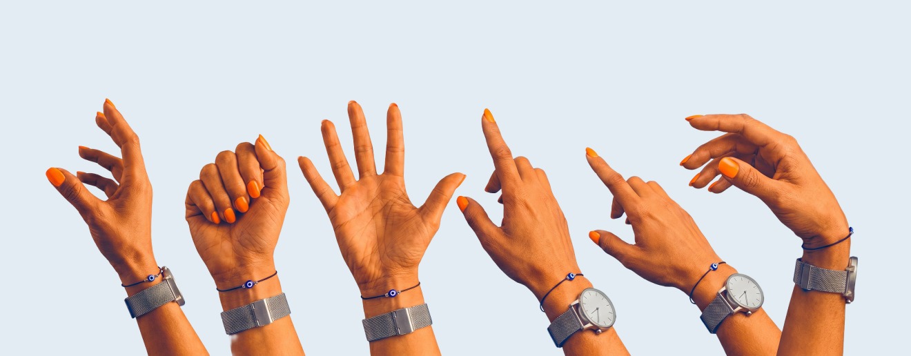
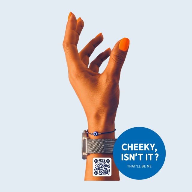
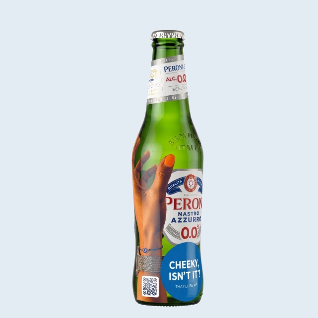
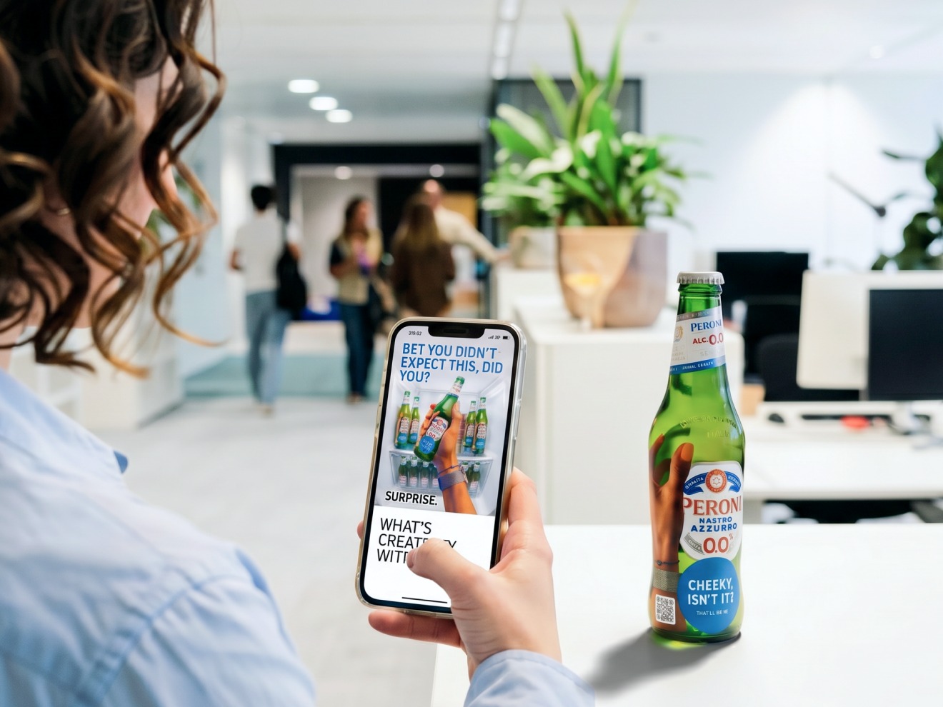
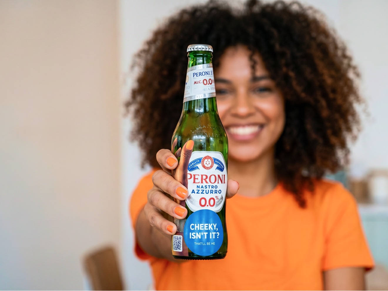
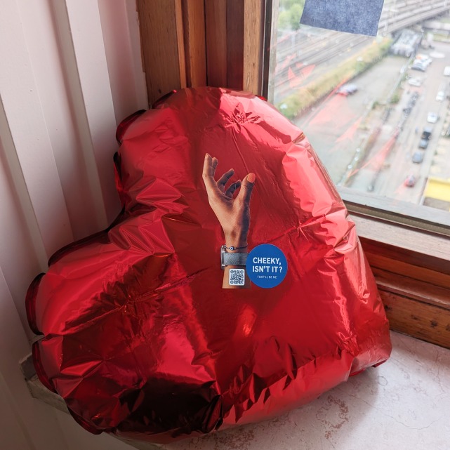
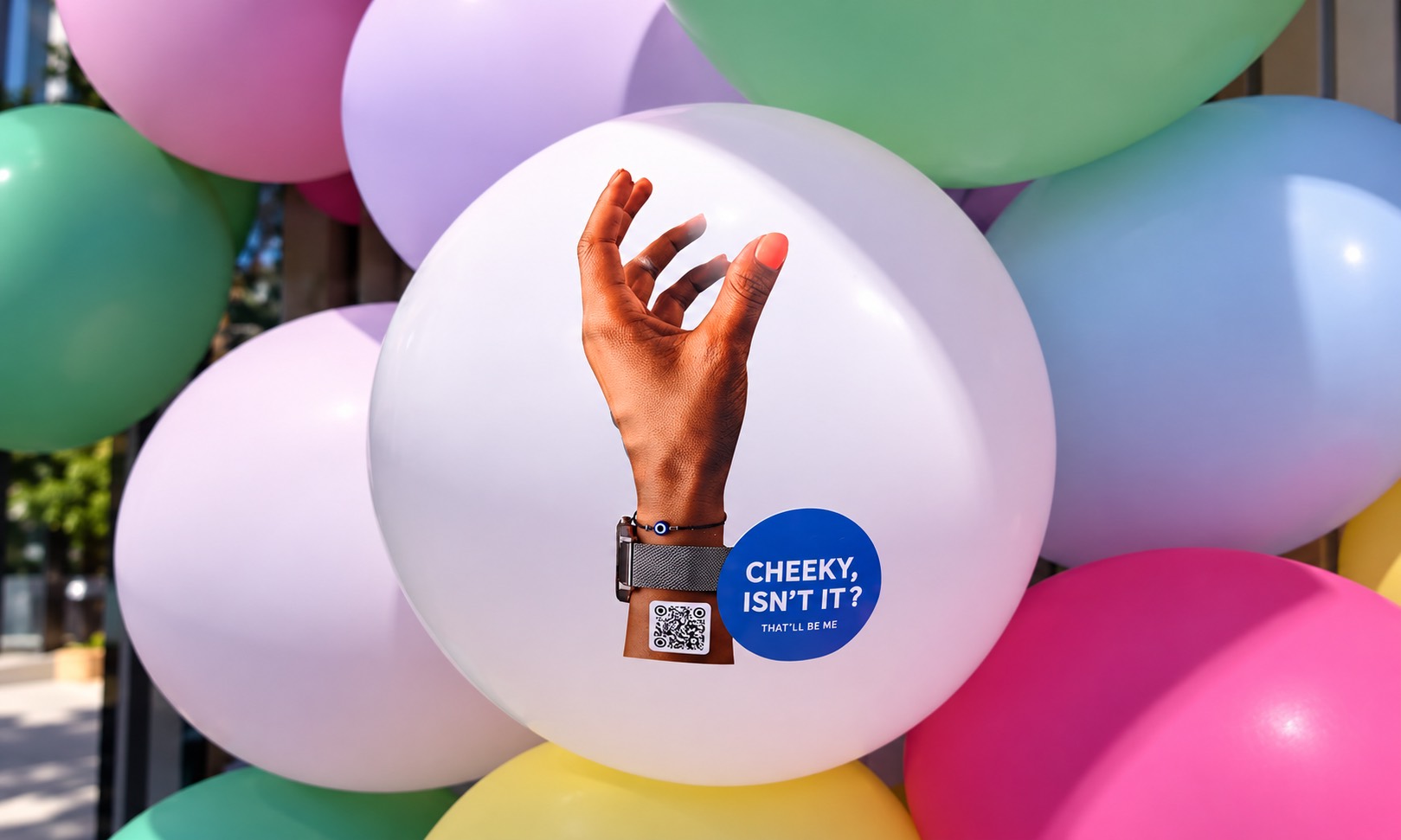
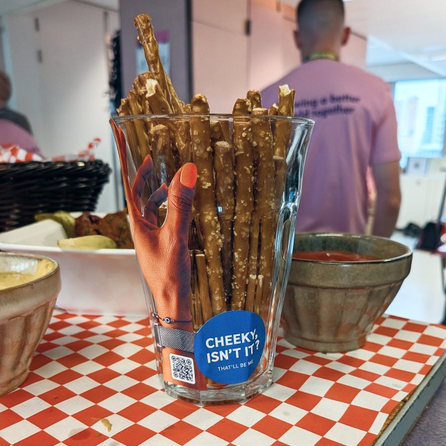
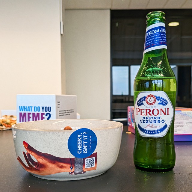
The goal was never a job offer. It was to be seen. These nights run on one shared ritual: sooner or later, everyone's moving studio to studio with a beer in hand. So the bottle became the media. The product wasn't my work - it was me. Since my nail colour became the detail people place before they know my name, I photographed my hands and printed it onto stickers: one line, “Cheeky, isn't it? That's me” and a QR code to the mobile-targeted landing page. No name. No title. No "hire me." A bold invitation, the reveal waited on the other side.
Concept
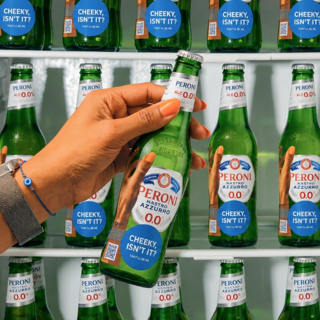
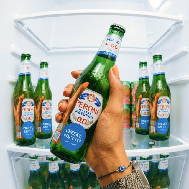
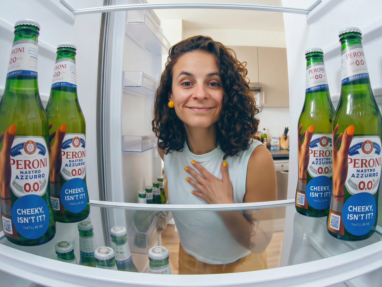
The scan didn't drop you on a CV or a regular portfolio. It landed on a question of its own - whothehellisme.com, where the fridge reveal turned literal: a hand grabbing a Peroni, a fridge full of them, and one line of copy: "Bet you didn't expect this, did you? Surprise." Then it flipped the angle entirely: when the page introduced me, the photos were shot from inside the fridge, looking out - the exact reverse of the reach you'd just made toward it. You weren't looking into the fridge anymore, you were being met from within it. The reveal never dropped the act. Even the portfolio arrived in the sticker's voice - what's creativity without cheekiness? - right down to the sign-off: beer is on me. In this campaign, the joke and the pitch were never two different things. And nothing went unmeasured - every scan was tracked, turning curiosity into a number and even country that I could actually read.
Activation
I built it for two moments. The first was for the night: you open a fridge and find every bottle wearing the same hand and the same question. The idea only worked on the beer - the fridge was its entry point, the one spot everyone comes back to all night. That's the whole reason it went nowhere else - not on the wall, not on the desks. So the rule was volume and discipline in equal measure: as many bottles, across as many of the 47 studios as one night allowed and only ever on the drink. The one surface that would move on its own, hand to hand, across the rooms.
Extension
The second was for after. Bottles get emptied and binned; by morning, the campaign would be in the recycling. To solve this, I would print magnets too - same hand, same question - for the fridge doors themselves. When the night got me seen, the magnet would keep me there the week after. And yes, it was uninvited - that was the whole point. This was a room built entirely of people who make campaigns for a living: the most stunt-literate, marketing-proof audience there is. The only way to land with them was to play their own game one degree cheekier than they would expect.
Night had other plans
On brief, the campaign was clean and everything was set to go. On that night, almost nothing went as I planned - and that's exactly the part that's worth keeping.
1. The first crack showed early and it wasn't even creative, but human. I'd brought in someone to help place the stickers, but while I was being surgical about where each one lived and why, they were going up all over, wherever they'd land - a move that it was quietly undoing the whole point of the campaign. She'd come from outside strategy and design and I learned that a concept this instinctive doesn't survive being handed to someone who doesn't think in it. When she unexpectedly stepped away partway and I was left to carry the evening solo, I learned to plan for the gap: at this scale, two committed pairs of hands aren't enough. Ambition like this needs depth on the bench.
2. Then the channel I'd taken for granted turned out not to be mine. I'd assumed (and brought from past experiences) that the fridges would be open everywhere, when actually several agencies served the beers from behind a bar. No fridge, no clean placement and a few stickers ended up in compromises the concept never intended. The reveal had one major point of failure too: one agency didn't allow the teams to scan QR codes due to privacy grounds, so there, the landing page simply didn't exist. And then there was the scale. Even narrowed to ten of the 47 agencies, covering them all on foot in one night was ambitious - especially with the good problem I kept running into: the night kept throwing genuinely talented, curious people in my path that I couldn't help stopping to talk to.
3. One piece never even made it to the night: the magnets - the entire second moment - simply weren't printed in time. The layer built to outlast the event never reached the event at all. That lesson had nothing to do with the night and everything to do with what came before it: the part meant to last the longest needed more of my attention than I have applied.
Impact
The real test of a campaign like this isn't the night - it's the days after. This one survived it. A few dozen scans came through, and the tracker let me watch the curiosity travel: not just how many, but from where - pins landing in more than one city before the night was even over. The stickers were fewer than I'd planned. The count was always going to be small - but that was never the point. What came next was: messages from people who'd held the bottle, scanned the question, and wanted to keep the conversation going. In a room full of people who do this for a living - the hardest crowd there is to surprise - the cheeky little sticker got through.
The real return was one only I could collect. I'd run a full campaign end to end - strategy, concept, design, production, and the chaos of pulling it off live - solo, no client, no brief, no safety net and in one month. Owning every piece of it - the good calls and the bad ones - taught me more than months of polished, sign-off-heavy work. Almost none of it went to plan - and that gap, between the plan and the night, is where the real lessons lived. Would I do it again? Without question - only sharper next time. Not because it went perfectly (far from it), but because this is what I do: the idea, the strategy, reading the angles and carrying it all the way out into the world. And damn, honestly? It was a hell of a lot of fun.
Image credits: the first four images are © Agency at Night. All "Who the fuck is Henry?" visuals remain the property of their original Portuguese creator.